Designing a logo for anything isn’t easy, but it’s especially tricky for your cannabis brand. You want it to be memorable and identifiable, unique and meaningful — but the pitfalls for bad marijuana logo design are many.
Every logo should contain a few crucial components:
- Your company name
- A unique symbol
- Ability to work in color or black and white
Then you can decide if you want to include a shape around your symbol and name. Another optional component is a branded slogan if you have one. Everything you include needs to work together in a way that makes sense and is aesthetically pleasing.
Your logo should help your customers remember your brand and products in a positive way. Marketing experts in the cannabis industry know the faux pas, and you should too. Here’s what to avoid when creating your cannabis logo design:
Overly Complex
Let’s say you’ve got a beautiful line drawing of a hemp field with a farmer planting under a partly cloudy sky filled with peace doves. Save that for the wall behind your register. It’s way too complex for a logo.
When the images of a logo are too finely detailed, you’ll run into problems when it’s reproduced on a smaller scale. Your customers may have trouble understanding all the elements, and you run the risk of it looking amateurish. Keep it simple.
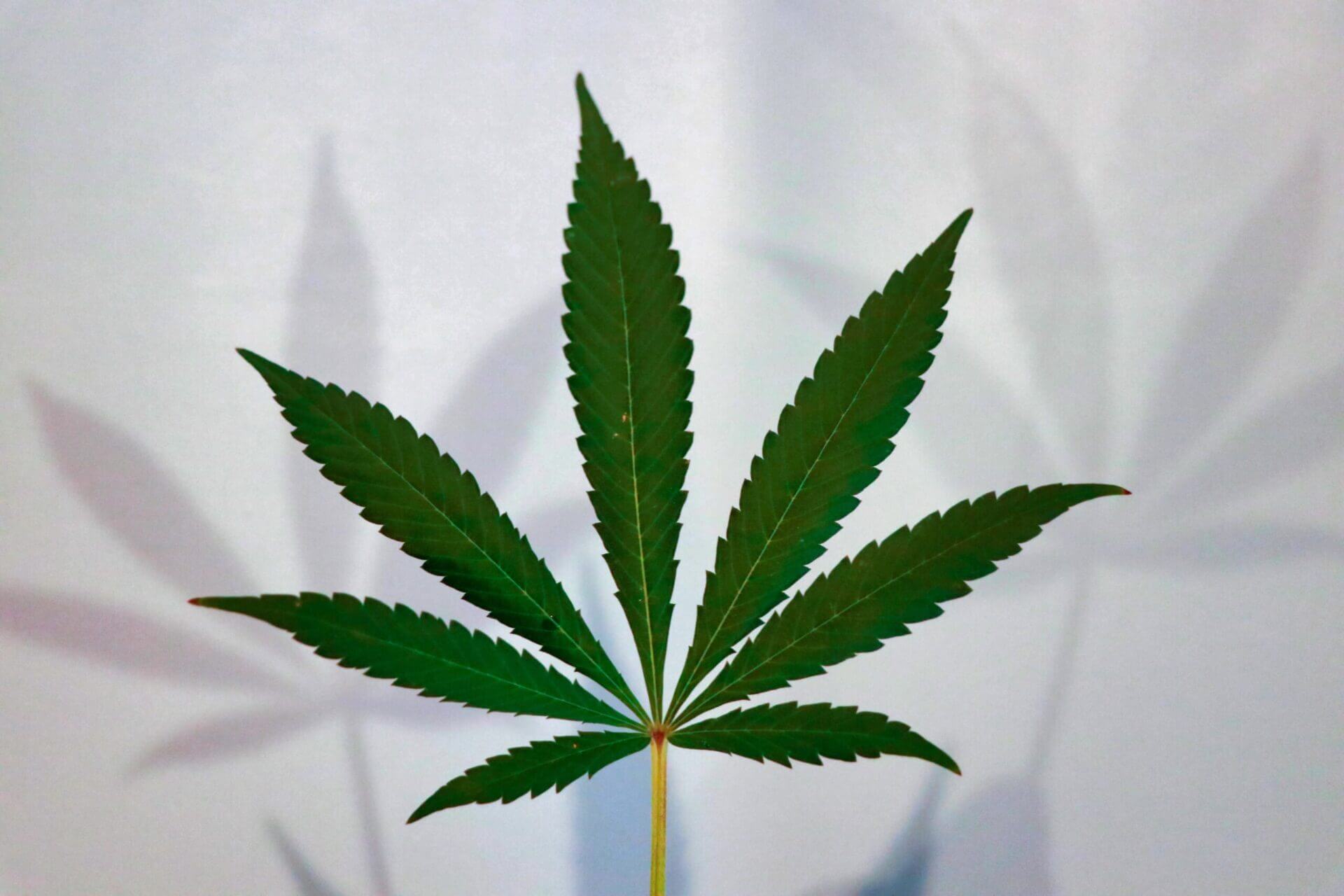
A Marijuana Leaf
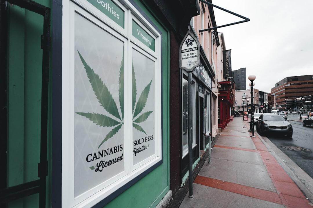
Of course, your products are cannabis-based so it may make sense to simply have a marijuana leaf as your logo symbol. But you’ll be one of hundreds of businesses doing the same thing.
The cannabis leaf is overused in the market and lacks differentiation. You may discover challenges when it comes to advertising and marketing in the future if your logo looks like others. Get creative.
The Color Green
The obvious go-to color for cannabis-related businesses is green. But it presents the same issue as the marijuana leaf: Relying on the color green actually makes your logo less memorable. It’s almost cliché.
One exception to the rule here is when green is used in combination with other colors. But then it comes back to the need for simplicity — the best logos will work in black and white as well as color.
Appealing to Children
You can have a fun-loving atmosphere as part of your business plan, but that doesn’t mean you should make your cannabis operation look as if you’re targeting children. Stay away from cartoons or silly characters that may suggest a family-friendly vibe.
It’s a blurry line when it comes to appropriateness, so err on the side of caution. It’s better to be safe than sorry.
Instead, Work With Professionals
When deciding on a logo for your cannabis business, the best bet is to work with a professional. You’re less likely to run into problems when it comes to reproduction, and you’re more likely to help your customers remember your service and products in a positive way. Want to work with design experts who know the industry? Connect with HIGHOPES to learn more about its cannabis brand identity consulting services today.
