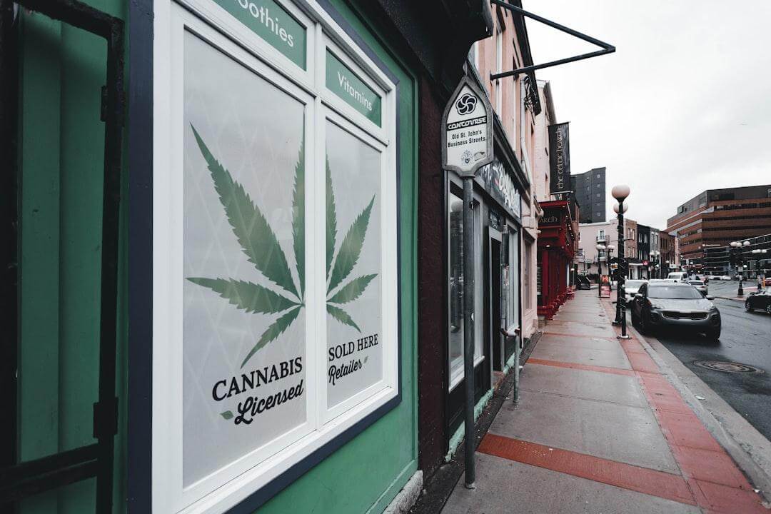
What makes the different between great cannabis packaging design and poor packaging design; Is it simply the “pop” of the colors and cultural relevancy, or is there something deeper at play? In this article, we’ll be picking apart this study on the effectiveness of packaging of hedonistic products mirroring, as closely as we can, the cannabis product packaging we see on shelves today.
What is Willingness To Pay?
Willingness to pay roughly relates to the average price your consumer is willing to pay for a particular product. This, we may wrongly assume, sits squarely in the value of the product itself. As it turns out, our initial touch points with cannabis products and their packaging play a larger part in this key performance indicator. These are multifaceted, but for the sake of this study we’ll be focusing on the following:
Perceived Weight
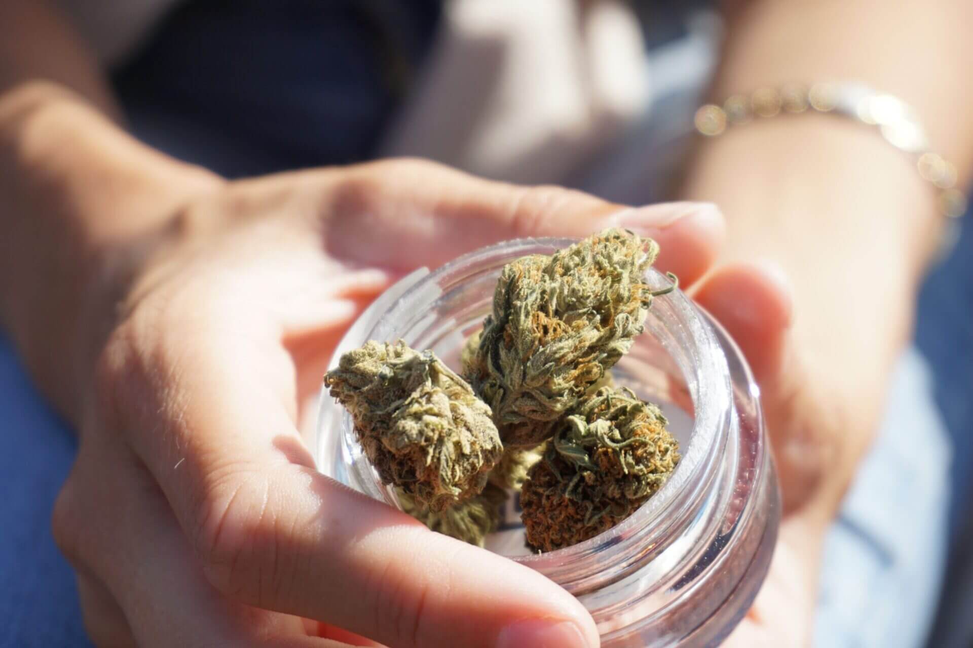
In most states, our first interaction with cannabis products occurs with our eyes – across the shelf or within a glass case itself. Here is where we make our 10 – 15 second decision on purchasing our cannabis product, or forgoing. This of course happens subconsciously – and perceived weight is one of our unlikely factors in our purchasing decision.
The primary reason, in this category, that perceived weight is affecting willingness to pay is via perceived “flavor intensity.” Simply put, the heavier the product looks – the more the consumer believes the flavor is intense and positive. This has obvious implications to the cannabis packaging design we perform at our agency, in which we want to increase the perceived weight of a product for our consumers across the shelf in edibles, concentrates, and flower – but how? Well it turns out that positioning of images tends to be a driving factor.
The researchers found that visual assets placed within:
- Bottom
- Right
- Bottom Right
Of our packaging influences heavily the perception of weight. Anytime we are designing cannabis packaging, we can arm ourselves with this knowledge to make relevant products now seemingly more “weighty” and increase the perception of flavor and intensity. That’s not all though. As it turns out, the perceived weight also contributes the to “satiation” of a product – whereby the consumer believes that the weight is directly correlated to how dense and filling that product can be. These of course, all tie back to increasing the willingness to pay for our product.
Other Factors of Note
Beyond perceived weight affecting how much a consumer is willing to pay for our cannabis product – we can use design to craft a message that is very universally interpreted. For instance, the use of “hard” looking packaging affects the user’s perceived quality of said product. Textures also play a role in telling that story (ie. a potato chip bag’s crinkly nature, and difficulty to open, create the perception of crispness and freshness).
On the topic of sweetness, researchers have determined that you can increase the perceived sweetness of a product using round, voluminous shapes (eg. circles) and semantic (common) language to increase the consumer’s sensitivity to those tastes. Pretty cool!
Wrapping up
Increasing the average price a consumer is willing to pay for our cannabis product, purely with packaging design, is clearly worth investing in – as the net profit for materials and agency investment can be significant. There are many other factors that contribute to a consumer’s willingness to pay for cannabis products as it relates to packaging – all of which should be taken into account when undertaking your cannabis packaging design.
Need help with your cannabis packaging design? Reach out to our team for a consultation to get you started on the right foot!