As marijuana becomes more mainstream, businesses in the industry are looking for ways to stand out from the competition. One way to do this is through thoughtful and strategic marijuana design, including the use of brand design color palettes.
A color palette is a collection of colors that are often used together in design. When creating a marijuana design, it’s important to use color palettes thoughtfully, as they can play a big role in shaping the overall look and feel of your brand.
Let’s take a closer look at the key factors you should consider when designing for a marijuana brand.
Your Brand’s Goals
The first step in any design project is to understand the goals of your brand. What are you trying to communicate with your design? Is your goal to look professional and trustworthy? Or is your goal to look fun and approachable? Your color palettes for branding should reflect your overall goals.
Symbolism
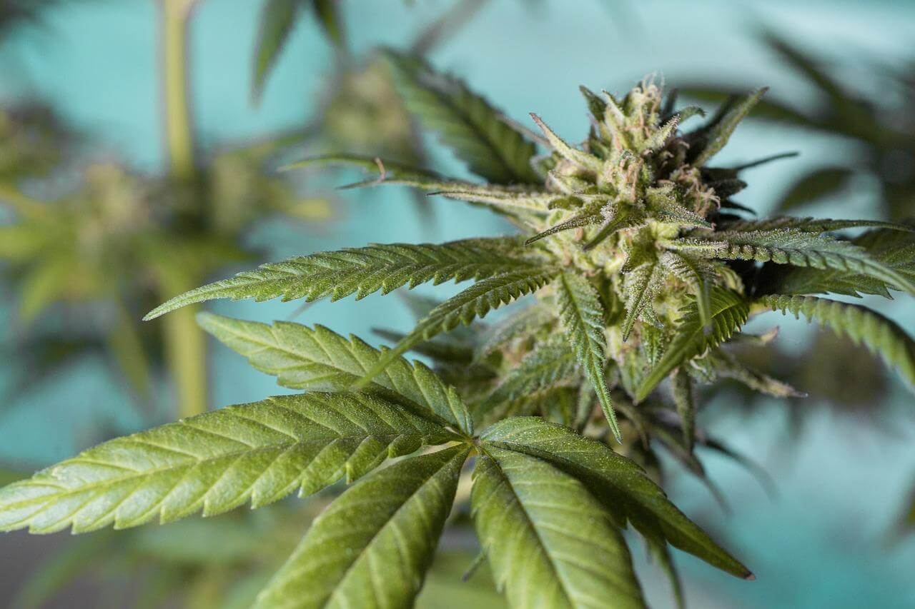
Marijuana leaves are green, so it’s no surprise that the color is often used in marijuana branding and design. Green can represent the natural aspects of the plant, as well as its healing properties. Other popular colors for marijuana design include brown, which can symbolize the earthy origins of marijuana, and blue, which can represent the calm and relaxation that many people experience when using the substance.
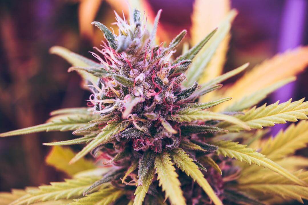
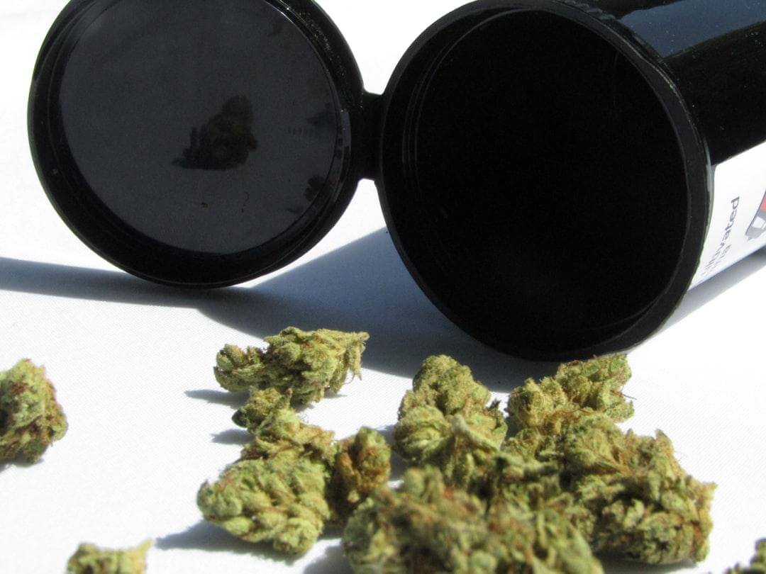
In addition to leaves, marijuana buds are often used in design. Buds can be any color, but they are most commonly seen in shades of green, brown, and purple.
It’s important to consider the overall tone you want to convey with your design. Are you looking to create a design that is earthy and natural, or something that is bright and playful? The colors you choose will play a big role in shaping the overall tone of your design.
Strategic Color Combinations
You can use color palettes in marijuana branding to communicate different messages and create different feels. Here are a few ways to use color palettes in your marijuana design:
- Use colors to create contrast. You can use high-contrast colors to create a more eye-catching design. For instance, you might use a light green against a dark brown or blue.
- Use colors to create a theme. You can use color palettes to create a cohesive look for your brand. For instance, you might carry the colors throughout your website, packaging, and advertising.
- Use colors to communicate different messages. Different colors can create different reactions in people. You can use this to your advantage by choosing colors that communicate the message you want to send. If you want to communicate relaxation, you might use blue.
When in Doubt, Don’t Be Afraid to Experiment!
The best way to find the right colors for your marijuana design is to experiment. Try out different color combinations and see what works best for your brand. Don’t be afraid to try something new! The worst that could happen is that you’ll end up with a design you’re not happy with, which you can always change. And who knows? You might just end up with a design that’s truly unique.
Final Thoughts
If you’re not sure where to start, there are many resources available that can help you choose the right color palette for your marijuana design. Once you’ve selected a palette, be sure to use it consistently across all of your marijuana branding materials, from your website to your packaging. By using color thoughtfully and strategically, you can create a marijuana brand that is truly unique.
At HIGHOPES, we specialize in marijuana branding and design. We can help you create a cohesive look for your brand that communicates the message you want to send. Contact us today to learn more about our services.
