
Are you looking for a sleek way to make your brand look more professional and sophisticated? Insert minimalism. This is a popular style of branding that many modern companies use to stand out amongst a sea of competitors in their industry.
But what is minimalism, and how can you use it to improve the look of your cannabis brand?
Minimalism is an ancient Zen Buddhist philosophy from the Far East that many American companies began to adopt in the 1960s. It’s based on the idea that “less is more.”
In the world of branding, it’s based on design choices that are simplistic yet tasteful. It’s a beautiful art that can be difficult to master, and we’ll explore the nuances of minimalist branding here in this article.

Pros of Minimalist Branding
There are many benefits of taking a minimalist approach for your brand:
- Modern Aesthetic – Younger demographics especially value aesthetics and simplicity today. A minimalist approach can make your weed branding more attractive to young professionals.
- Air of Sophistication – When done correctly, minimalist branding can create an atmosphere of sophistication. Think of a man or a woman in a black-and-white suit. It’s simple, yet professional.
- Visually Appealing – Minimalist design can help your brand stand out amongst all the overly saturated packaging designs commonly seen in hype beast cannabis products.
Cons of Minimalist Branding
Though minimalism has some great benefits, there are some downsides:
Challenging to Master – Though it may seem like a simplistic approach, the nuances of minimalism require acute attention to detail, and it takes a trained eye to get it right.
Can Seem Too Generic – Sometimes, minimalism can come off looking more generic than sophisticated. Some simple branding designs may come off “low effort” rather than “cool and sleek.”
May not be Applicable – Some brands may have difficulty implementing minimalism because it may not apply to their image. If your company is known for having a lot of personality and depth in its messaging, implementing this approach may not be congruent.
Examples of Minimalism in Branding
Let’s look at some examples of brands that do minimalism very well:
Apple

Notice the off-white background and the stem of the apple that is parallel with the top and the bottom corners of the bite.
Stiiizy

Notice the sharp edges on the I’s and the big and tall lettering taking up a large area while still striking a good balance of spacing.
Mastercard
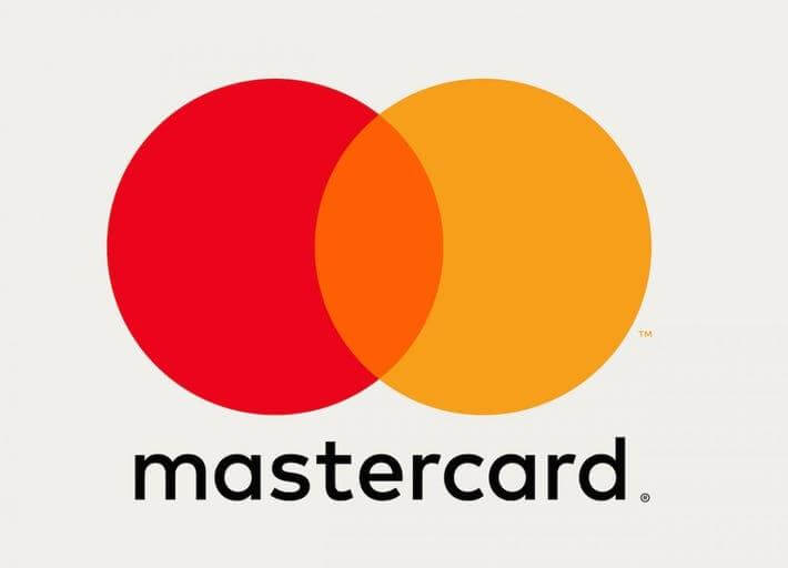
Notice the perfect blend of yellow and red to create orange in between the two circles. Also, notice how the circles are slightly larger than the word “mastercard” and the perpendicular placement of the trademark symbols.
Minimalist Tips for Cannabis Brands
Minimalism isn’t always just black and white. It’s about striking the perfect balance of white space, color, and subtle details that make your brand’s images pop wherever people see them. Here are some tips for achieving a perfect balance of minimalism:
- Prioritize your messaging: Less is more, but make sure your brand’s message is understood clearly and concisely among your audience. A simple phrase such as “Dank Weed” on a pack with a white background can speak volumes if your brand has developed that reputation.
- Use small details: In many of the examples we looked at, very minute details give the logo character and depth. Try to utilize techniques like these in your logo and designs.
- Work with Professionals: Minimalism is more of an art than a science. Marketing and branding experts, such as Highopes, can craft the perfect minimalist look for your website, logo, and packaging if you’re stuck on how to do branding in this unique style.